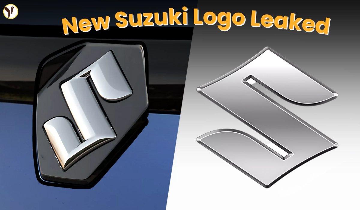

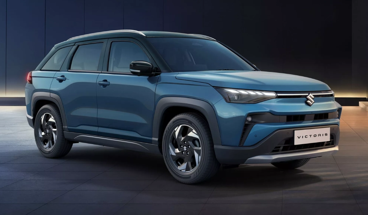
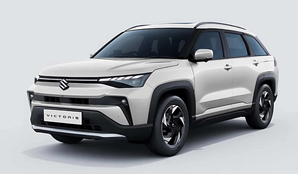
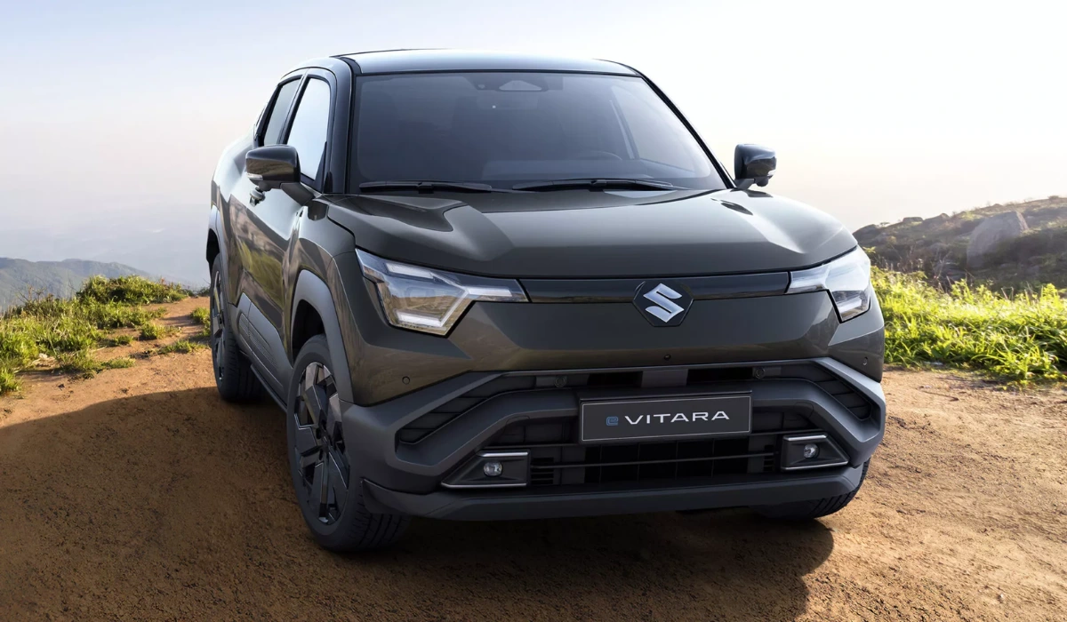
After more than 20 years, Suzuki has made modifications to its heritage logo. The recognizable bold "S” that many of us were accustomed to seeing on Suzuki automobiles, motorcycles, and ATVs has been refreshed to be cleaner and flatter. The shiny chrome that provided a 3D pop to the badge is gone, Instead, the new badge uses a bright silver finish with a perfectly polished 2D surface to be more accessible to the digital world we live in. This change isn't simply visual; it represents Suzuki's design, technology, and sustainability for a new era.
2025 Suzuki New Logo Design and Meaning Explained
Although Suzuki's well-known "S" remains the same, the design elements have been updated to contemporary specifications. The updated badge is:
- Flatter and simpler to facilitate use across digital media such as apps and websites.
- Chrome-free and utilizes a high-brightness silver to replace the heavier metal finish and reflect light softer.
- More environmentally friendly, as the new process requires less chemical plating and contributes to reducing the impact of production.
These updates might seem minor at first glance, but they lend Suzuki a cleaner identity that functions on screens, car grilles, and also appears in small smartwatch icons.
Why Suzuki Chose to Redesign the Logo Now
Automakers across the globe are simplifying their brands, and Suzuki is following suit. With car dashboards and advertising moving to digital screens, flat designs are more convenient to read and cheaper to manufacture. Eliminating chrome is also a pledge to environmentally friendly practice that resonates with today's environmentally concerned customers. The new design is inspired by "By Your Side," Suzuki's global slogan and commitment to be by the customer side when confidently transcending into the world of electric and technologically advanced automobiles.
When and Where the New Badge Will Debut
The new logo will publicly premiere on October 30, 2025, at the Japan Mobility Show in Tokyo. Even though the debut is in Japan, very soon after, U.S. fans should be able to see the new logo on Suzuki motorcycles, ATVs, and marine products. The concept cars at the show will be the first vehicles to show off the logo design and give a look at how Suzuki's next-generation vehicles—including hybrids and EVs—will represent this updated branding on a global stage.
What the Change Means for U.S. Buyers
Although Suzuki has ceased car sales in the U.S., it continues its operation of motorcycles, ATVs, and marine engines. For American buyers, the new logo indicates Suzuki's developing international transition. It hints at the potential of a larger selection of electric vehicles and revisions of its existing array of bikes and outdoor products. Whether you prefer Suzuki's quick sportbikes or the high-performance off-road vehicles, expect to see the new logo on U.S. dealership showroom floors across the next calendar year.
How Suzuki Balances Heritage With Modern Style
Among the most intelligent decisions in the redesign is how Suzuki kept the proportions of the “S” symbol essentially the same size and shape as the old badge. By doing this, long-time fans will recognize the badge instantly. It's a fine line to walk; Suzuki wanted to keep its established identity, but a cleaner and more modern, yet recognizable, aesthetic was needed. The result is an emblem that feels familiar but hints that the brand is moving forward.
A Step Toward a Greener Future
By eliminating chrome plating, Suzuki is not only recognizing a design trend, but more importantly, taking a practical environmental consideration into account. Chrome plating requires chemicals associated with a potential environmental hazard, and a simplified production process creates less waste. For the customer who has a strong interest in sustainability, this slight design adjustment signals a larger message: Suzuki wants to play a role in the solution as the automotive industry evolves to consumption alterations.
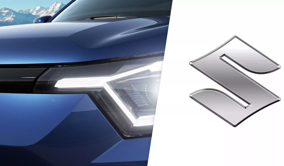
Suzuki New Logo Changes and Specifications Revealed
|
|
|
|
|
|
|
|
|
|
|
|
|
|
|
|
|
|
|
|
|
|
|
|
|
|
|
Conclusion
After twenty-plus years, Suzuki is changing its logo for the first time not just for a simple design change but to illustrate where it is headed next. This redesign does take the familiar “S” but removes the heavy chrome and 3D shine that adorned the previous emblem. Suzuki takes a bold step addressing its heritage while appealing to today’s needs for a flatter and cleaner badge. Instead of shiny chrome that pops extra in prints, the new badge is functional in a digital world and supports greener production, while easing Suzuki into its next step with its vehicles and product offerings. “For our fans in the U.S., it’s a reminder that small changes can mean a lot to big ideas while the automotive industry seeks to move beyond gas-powered vehicles."
Source(Image / Thumbnail): www.autocarpro.in